How To Color Coordinate Outfits For Photos
This guide will show you how to color coordinate outfits for photos. Most people are confused with the endless pairing of options. The thing is that it doesn’t have to be super complicated or stressful to put together a color coordinated outfit.
Key Takeaways
- Start by identifying the colors of the area where you’ll be photographed. Build you’re outfit around these colors.
- All outfit colors fall into three main categories: neutrals, earth tones, and black.
- When coordinating outfits, stick to one or two categories—never all three.
- If using two categories, limit the second to a single accent piece (e.g., accessories like shoes, belt, or one standout garment like a shirt or mom’s dress in the case of family photos).
- Use similar tones to harmonize with your setting.
- Use contrasting tones to stand out from your background.
- Examples: Earth tones would compliment a forest setting while neutral colors would stand out. Urban areas are often neutral, so earth tones can help subjects pop while neutral tones would blend.
The Three Color Categories
The easiest way I’ve found to color coordinate an ensemble is inspired by this video from Parker York Smith. In this video he makes this simple by breaking colors into three categories:
Earth Tones
Most simply put, earth tones are all the colors you’d find in nature. This includes bright, vibrant colors, and more muddy earthy colors with significant saturation.
Neutrals
Neutrals are white, pastels, greys and even dark charcoals. Less saturated earth tones fall into the neutral category at some point. Don’t get hung up where the line is just know it exists.
Blacks
The last color category is black. That’s it.


How To Color Coordinate Using The 90/10 Rule
Styling gets simple when you break everything down into earth tones, neutrals, or black. If you’re just starting out, stick to one category, or mostly one, and toss in a splash from another. A 90/10 mix is a solid place to begin if you want to experiment.
Example Color Schemes For Color Coordinating Outfits
Now that you understand how to group colors and balance them with your setting, let’s look at some real-world examples. These scenarios show how sticking to one or two color categories can create a cohesive look that either blends beautifully with the background or stands out in just the right way. Use these as inspiration when planning your own photo shoot.
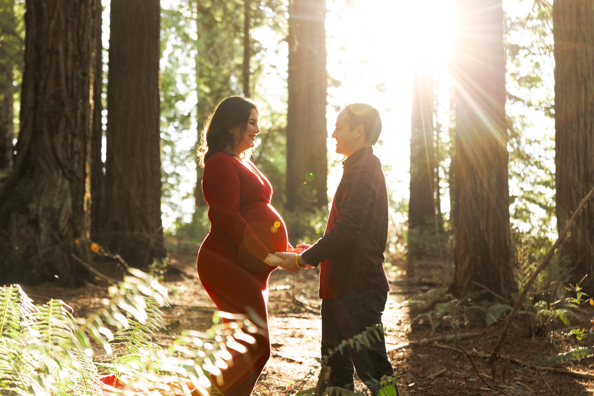
Earth Tones
The reason these colors work so well in this setting is because the forest is full of earth tones. By choosing outfits that are also earth tones, their outfits complement the background so they don’t feel separated from the scene.
To further style the scene, she chose a red dress to complement the greenery of the forest we planned to capture their photos in. This red both complements the forest setting and makes her the focal point without feeling disconnected from the environment.
Other colors can pop well in forest settings also like oranges and purples but if adding a pop of color feels tricky, just reach out. I’ll help you build a color scheme that fits your shoot perfectly.
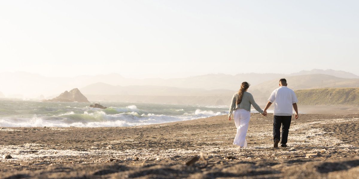
Neutral and Earth Tones
For this photo, the couple’s outfits are both neutral and earth tones. His shirt is white, which is a neutral tone. His pants, although blue, are fairly desaturated, which I would also consider a neutral tone. Her dress, being white (neutral) and covered with flowers (earth tones), doesn’t clash. Instead, it adds that pop of color that ties in with the surrounding environment.
Even though she’s arguably wearing more earth tones than neutrals and he’s entirely in neutral colors, the theme works because there are only two color categories in the whole photo. The background is full of earth tones and neutrals, and so are their outfits.

In short, the absence of black in their outfits is why this photo feels stylized with a defined color palette.
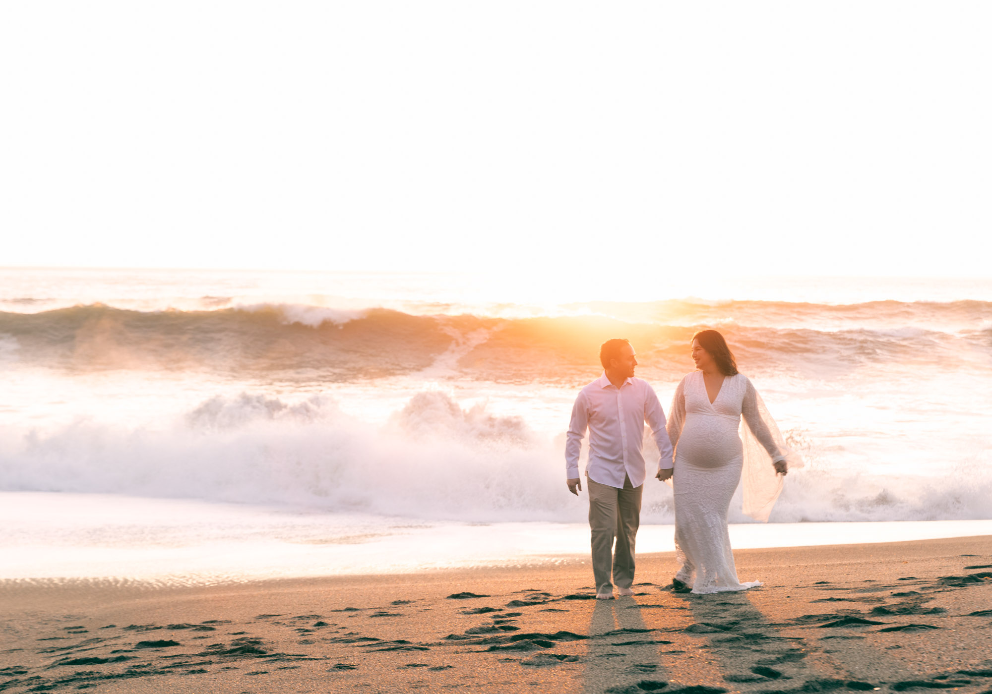
Neutral and Black
This couple is dressed in neutrals and black. His shirt and pants are neutral, and he accents his outfit with black cowboy boots. Her dress is black, which matches his accent color.
In this example, the third color category is the earth tones in the background, which helps them stand out. The general rule is to dress in no more than two color categories.
If you want to blend with the background, the entire photo should stay within two categories. If you want to stand out, like in this case, still only wear two categories and let the third be the background of wherever your photos are taken.

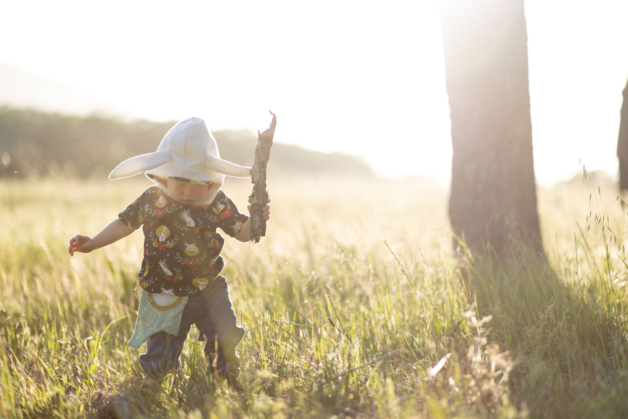
Neutral With Earth Tones
These kids were photographed in a park full of rich earth tones like the warm grass, soft browns, and muted greens.
With neutral pops from the daisies scattered across the scene, their light, neutral color outfits not only complement the flowers but also help them stand out beautifully against the colorful earth tones.
It’s a perfect example of how contrasting colors can add pop while also tying togeather with elements of the photo.

Where to Rent Outfits for Your Photo Shoot
Buying coordinated outfits for a family photo shoot can get expensive, especially when you want everyone looking their best in clothes they might not wear again. The good news is that you don’t have to purchase everything. These clothing rental services let you rent high-quality, photogenic outfits for a fraction of the cost, making it easy to style your own outfits or a group without breaking the bank.
Here are some of the top places where you can rent outfits for your session:
- Rent the Runway: Designer women’s and maternity wear. Wide selection of designer styles for moms and teens. Great for family sessions or holiday cards. Offers one-time rentals or monthly plans.
- Nuuly: Trendy and casual women’s wear
- Rent six pieces a month from brands like Anthropologie and Free People. Ideal for effortless, Instagram-worthy looks.
- Armoire: Professional and chic women’s attire. Flattering, timeless outfits with personalized styling. Great for an elevated look without shopping stress.
- Rainey’s Closet: Boutique children’s clothing. Whimsical outfits for babies and kids—tulle dresses, vintage overalls, and more. Perfect for magical photo moments.
- Flutter Dress Rentals: Flowy women’s and maternity dresses. Adjustable, flattering dresses that move beautifully in outdoor or lifestyle shoots.
- Dalliance Bespoke: Handcrafted, one-of-a-kind dresses. Romantic, timeless pieces you won’t find anywhere else. Ideal for standing out in your photos.


Struggling With What to Wear? Don’t Worry, I’ll Help You.
If you’re feeling overwhelmed about how to dress for your portrait session or family pictures, don’t worry, I’ll help you. The best place to start is by choosing your photo location, then building your outfit choices around the colors in that setting. Once you’ve picked the spot, I can help you identify a color palette and create a style plan that fits your vision.
If you’re ready to start planning your session, you can contact me here and I’ll walk you through it step by step.